If lettering is your pending subject, here we list the materials you need and some tips to get you started in this art of drawing letters.
The fact that letters and calligraphy are in fashion is no novelty. We can see the number of decorative objects with this kind of artistic letters and many of you have been introduced to the world of calligraphy as a hobby to enjoy and relax.
But in the world of artistic letters, there are much more than just typography and calligraphy, there is also lettering. And what is lettering? The art of drawing letters. How does that sound? Well, if you want to know more about lettering, this is your post! :)
 To practice lettering we need to have some basic materials at hand, which are similar to those we need in calligraphy:
-Paper: Paper is essential, but we can't use any paper. We need one that allows the ink to flow easily so that we can draw the letters. We recommend a heavy, consistent, non-transferring, and with not much grain (so that the pen moves easily).
We can recommend the following ones:
 - Alternate pressures. This is the key to lettering. Every time you make an upward stroke, make less pressure so that the line gets thinner. For the downward strokes, make more pressure and the line will be thicker. The combination of both strokes has spectacular results. For this effect, it's important to take into account that you only be allowed to do it with the flexible tipped markers: Fudenosuke, Tombow ABT, Art & Graphic, Clean Color, etc.
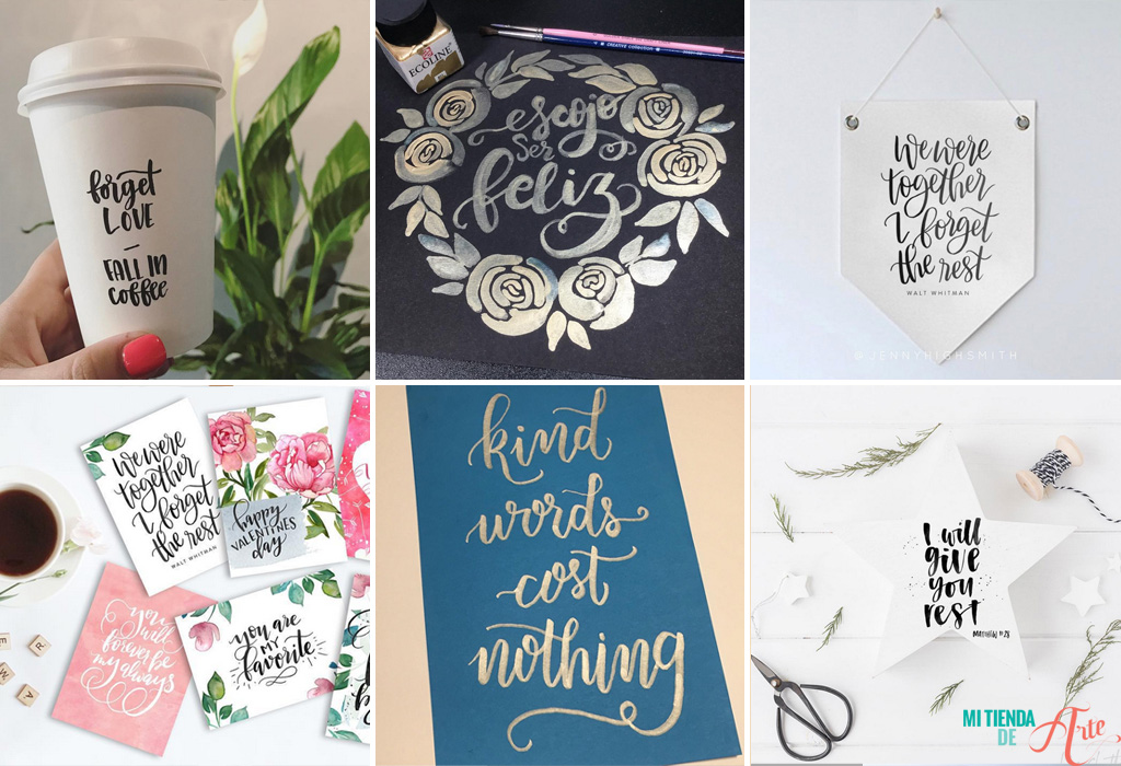
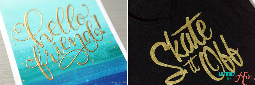
- Look for inspiration. Pinterest and Instagram are full of examples of lettering that will inspire you and can also be used for practice. Choose a phrase or word that you like and start by trying to imitate the strokes, then make small changes until you find your own style.

@jennyhighsmith / @lissletters / @mrwashisan
As we said, lettering is the art of drawing letters and therefore is different from calligraphy, which we could define as the art of writing beautifully. In other words, calligraphy is a discipline to create letters following some rules, on the other hand, lettering consists of drawing letters with absolute freedom, making flourishes, and thus defining our own style. Lettering isn't only being used in advertising, design, fashion, etc, it has also reached the world of scrapbooking, and we're about to see how we can include this art in our projects. But before we get to that point, we want to give you some necessary tips to start in the wonderful world of lettering.Lettering materials
To practice lettering we need to have some basic materials at hand, which are similar to those we need in calligraphy:
-Paper: Paper is essential, but we can't use any paper. We need one that allows the ink to flow easily so that we can draw the letters. We recommend a heavy, consistent, non-transferring, and with not much grain (so that the pen moves easily).
We can recommend the following ones:
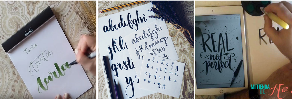
- Rhodia Notebooks: the best of the best for its use with markers! They come with dots and the Tombow markers roll perfectly on this type of paper.
- Caballo paper
- Canson's picture book
- Canson Marker paper (special for markers)
A few tips
As we said at the beginning of the post, the key to lettering is to draw the letters, but don't worry if you don't know how to draw, because the key here is practice, practice, and, above all, enjoying the process. In case it might be helpful to encourage you to draw beautiful letters, here are some tips: -Always make a draft of the composition before working on the final project. Look at how many words you will have in each row, the distance between the letters, etc. so that the composition is harmonious. -Start drawing in pencil and, when you have the final one, go over it with the pen or the brush. -You can use a line guide to draw the letters. We can make 4 lines that will help us to draw the letters, taking into account that the outer lines will serve as a base for the letters that are higher or have a tail (p, f, g, h ...). These guides can be very useful for all those who are starting their lettering journey.
- Alternate pressures. This is the key to lettering. Every time you make an upward stroke, make less pressure so that the line gets thinner. For the downward strokes, make more pressure and the line will be thicker. The combination of both strokes has spectacular results. For this effect, it's important to take into account that you only be allowed to do it with the flexible tipped markers: Fudenosuke, Tombow ABT, Art & Graphic, Clean Color, etc.
- Look for inspiration. Pinterest and Instagram are full of examples of lettering that will inspire you and can also be used for practice. Choose a phrase or word that you like and start by trying to imitate the strokes, then make small changes until you find your own style.
 http://www.theflowerjournal.es / http://mrwashisan.blogspot.com.es
Introducing lettering in scrap
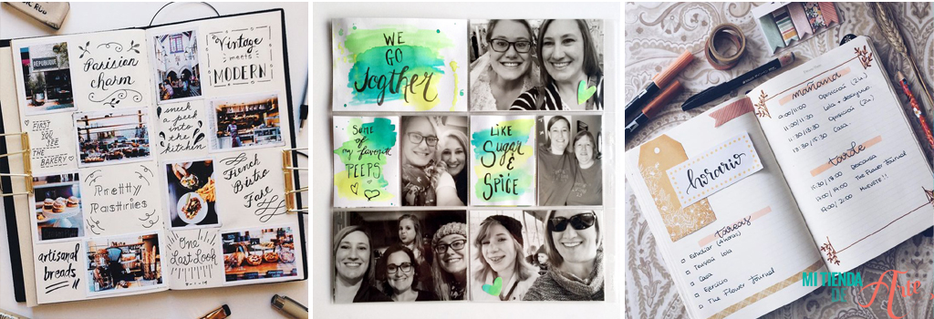
Just like calligraphy, lettering has a place in the scrapbook and in our Mixed Media projects - it'll give your personal touch!
kellycreates.ca / adriennesinklings.com / samallencreates.com
To practice drawing messages we can leave aside (even if it's just this once!) our beloved letter thickeners and instead, start drawing the titles of our LOs, album titles, or diary headings.
pepperandtwine.blogspot.com.es / adriennesinklings.com / www.theflowerjournal.es
A great way to practice is to include lettering every day (yes, every day we write) in our bullet journal or planners. Creating titles or our to-do list with lettering can be a lot of fun, and you can even combine lettering with calligraphy! If you are into Project Life, you can create your own cards with words or phrases drawn on them. This way you can create a totally personalized Project Life that suits you.
every-tuesday.com / makelyhome.com