The colour combination in scrapbooking is something very important, the choice of colours we select can change the aspect of our project and the mood of it. Therefore, the use of colour and its combinations can sometimes become a struggle.
To help you a little, we are going to talk a little about colour in this post, to have some basic notions that can help you a little when choosing the tones of our project.
Primary colours
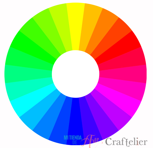
The whole colour spectrum is made up of a combination of three primary colours, which are cyan, magenta, and yellow. Then, and from a formation of these primary colours, we find the secondary colours: green, orange, violet, and purple. The mixture of these colours would leave us with the tertiary colours: red-orange, yellow-orange, yellow-green, blue-green, blue-violet, and red-violet.
Chromatic wheel
The chromatic circle is an organization or representation of colours that follow an established order, representing the primary colours and their mixtures. Many artists use the chromatic circle to build colour schemes. There are different colour harmonies and having a chromatic circle at hand is the best way to guide us when we are starting to combine colours. Once we are familiar with it, we can do without it, but it is important to keep it in mind at the beginning.
Monochrome harmony
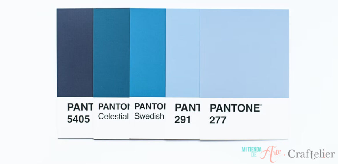
Coordinating colours following this theory means using the same colour, varying the intensity of the colour. You can choose, for example, the blue colour, and use different tones like navy blue, deep blue, baby blue... It is a very simple combination of colours that gives a feeling of sobriety and elegance. If you feel like your project is getting too boring, you can add details in its complementary colour, i.e. it's the opposite colour. Following the example of blue, you could pick a yellow or orange tone.
Triadic harmonies
This harmony occurs when using a colour composition in which colours are arranged as an equilateral triangle. For example the use of the primary colours cyan, yellow, and magenta.
Analogous
In this case, the colour combinations will be soft, i.e. you will choose a colour from the chromatic circle and one or two colours that are located next to it. Therefore, if you choose yellow as the main colour of your project, you can combine it with green and orange. If you want to give it a more bold style, you can choose to make a complementary -divided- colour harmony, which consists of choosing an adjacent colour and the opposite one. In this way, the contrast between colours is not so big. So, if you choose yellow, you could combine it with orange (which is next to it) and violet. In this way, we will give a more daring touch to our project without losing the harmony of colours.
Opposites
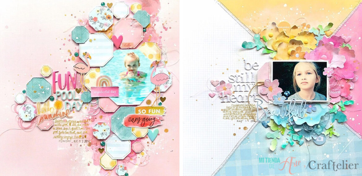
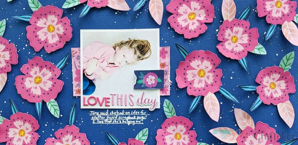
As its name suggests, it is about combining colours that are opposites in the chromatic circle. In this way, if you choose pink, you can combine it with green. With this type of colour combination, you can make your project eye-catching as these colours emphasize each other. This combination of colours will not go unnoticed.
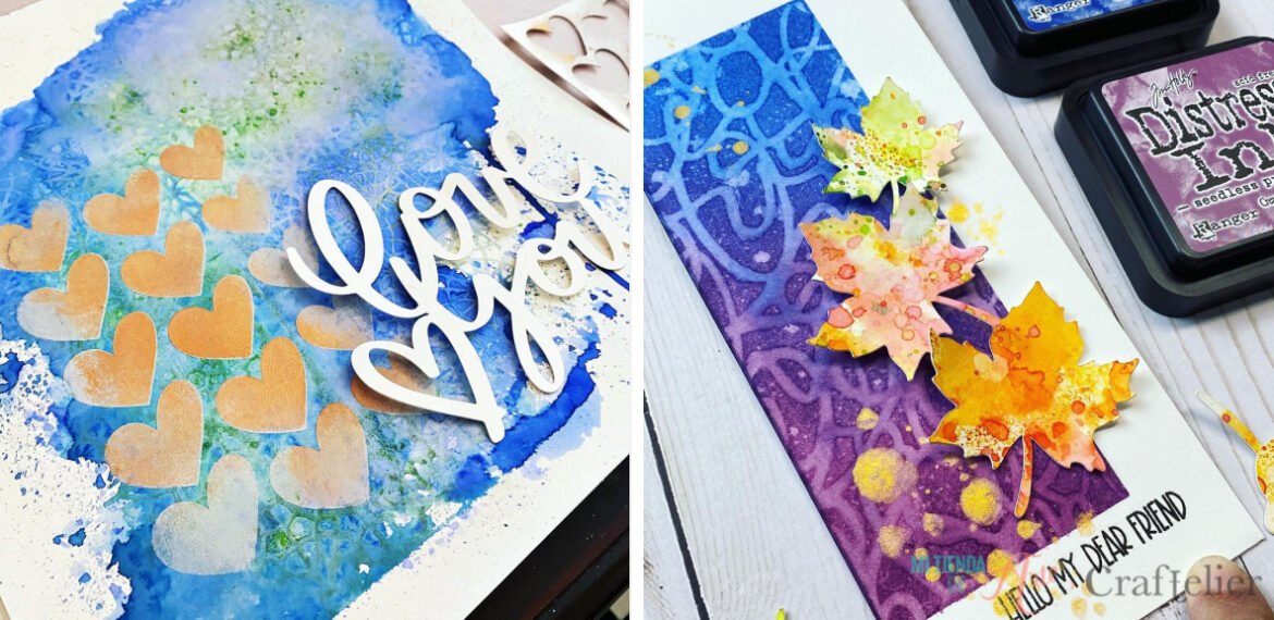
If you want to take a further step in your project designs and the colour combination, you have to take into account the colours of your photographs. Depending on the theme you have chosen for your project, your photographs may have very similar tones to each other, whether it is because you are doing a project with black and white photographs, your memories of the beach (with lots of blue colours), a day in nature (lots of green and brown colours). If you know in advance what kind of photos you are going to include in your project, you can play with those colours to create a more harmonious project. You can choose a key colour from the colours of your photographs and then choose the type of harmony you want for your project and go with it.
Another point to consider when choosing the colour combinations is the mood we want to set. Thus, you can choose whether you want a prevalence of warm or cool tones.
It is also important the proportion of colours used. An equal proportion in our colour scheme can result in a monotonous and boring project, so it is advisable to play with proportions. Choose one or two main colours and add details and pops of colour. In addition, it is always important not to work with more than four or five colours, so our attention is not diverted between so many colours.

Did you know about colour theories? Tell us in the comments how you usually make your colour combinations, do you follow these theories or do you let your intuition guide you? We'll read you in the comments! :)