There are different typographies to combine and add greater detail to your lettering work. Eight fonts you can easily make! We already know calligraphy and lettering have become trendy in the last few years.
We have talked about it in some past posts, but in case you are new to the topic, we recommend you to take a look at them: "Lettering for dummies" is perfect for those who have just discovered lettering and "Lettering using Tombow" is perfect to learn how to use Tombow markers. In today's post, we're talking about different types of calligraphy fonts. If you already practise lettering, surely you want to keep on trying new things! So, maybe it's time to try another! And why not combine different styles? Let's review some typographies to give you ideas so that you don't get stuck in your comfort zone! You know that there will be as many fonts as people. As calligraphy is handmade, it will always have something different and unique, it is the personal style each one of you will give to it. So, here are eight different typographies. You can use ballpoint pens, a pen or coloured markers. In this case, the material is almost the least important thing.
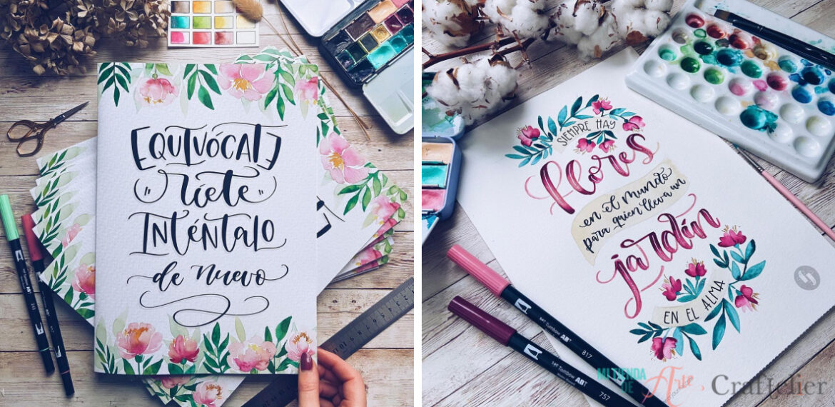
Brush lettering: is usually one of the first fonts you learn. It consists of making a thin stroke upwards and a thick stroke downwards, the traditional font you can achieve with Tombow or similar markers.
Dragged: as the name indicates, the letters are dragged downwards, lengthening the word at the bottom. This typeface is very elegant and romantic (the kind you see on wedding invitations).
Double outline: this typography is very easy to do, simply write as usual with a "bullet" tip pen, maintaining a wide separation between letters. Then go over the strokes going downwards to make them double and give them volume. This typography is very elegant, and you can use any type of marker or pen, even a BIC pen!
Double stroke: this letter is created in the same way as the double outline, but painting the interior part of the letters. You can paint the whole part or make stripes, and dots or fill in just certain areas.
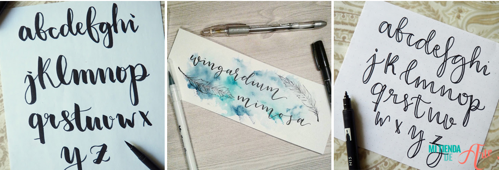
Triple stroke: is made in the same way as the double one, but repeats the strokes three times. The letter has more consistency, transmitting a strong and forceful message. It looks particularly good in capital letters.
Triple fill: as it is a larger letter, you can play with filling it both with strokes or lines and with colours.
Inner borders: usually made with sober letters, separating the thick part into two somewhat unequal parts with a line. The design is completed by adding a vertical line in the double area of the letter, which can be a zigzag, dots, small stripes, crosses, etc.
Remember that you can vary the heights and distances between the letters. It's important as it would help you to transmit different things. You can also add doddles to give a different and personal touch to your lettering message, something like small drawings like geometric patterns, floral elements, etc.
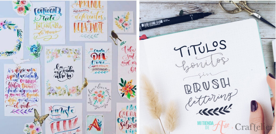
Of course, ideally, you can mix several fonts to produce messages with more power and personality.
Remember that less is more and, although the mixture can give great results, it is best not to mix more than two or three fonts in a single message.
Which typography do you like the most? Is your style classic, or do you prefer to innovate? Do you mix and match or do you always use the same one? Tell us in the comments!