We're in love with these flexible-tip markers! Today, we're explaining some tips to start drawingin letters with the ABT Tombow markers.
As we already said in the other post, one we made for lettering dummies, lettering is very trendy nowadays and it's important to use it on our projects. After talking about general concepts and the basic tips, now it's time to go deeper in the subject. To do so, we're going to use the best lettering markers: ABT Tombow. We're sure you've already heard about them!
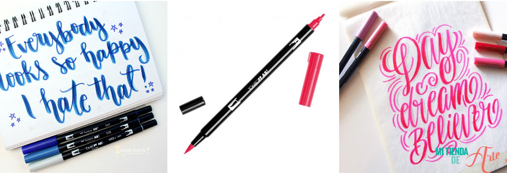 Probably you've heard a lot of good things about them, even us have talked about them sometimes, but in case there's someone new here, we're about to explain it. ABT Tombow markers are our favourites for these reasons:
- Their double tip: one is thin, for straight lines and writing, the other, brush-like, allows us to make versatile strokes and work with the pressure of the brush.
- They can be used as if they were watercolours: you only need a water brush to paint, make gradients or create backgrounds.
For these reasons, Tombow markers have become our greatest allies for practising lettering.
But where to start? We'll explain some tips, techniques and details that can be useful for your projects, especially if you are just starting out.
 - Create colour combinations. One of the great things about Tombow is that you can combine several colours to create amazing effects. Choose two matching markers and get started, the procedure is very easy. On a base or waterproof surface such as a methacrylate base - the kind used for stamps - paint with the lighter shade of marker (of the two we have chosen). Next, take the marker of the darker shade and mix the inks (photo 7). Finally, start drawing the letters (photo 8) and you will see the resulting effect is a gradient of both colours (photo 9). Spectacular and very eye-catching for our lettering sheets! If you continue drawing, you will see that the pen returns to its initial tone. Don't panic, Tombow pens don't get damaged by mixing colours!
Probably you've heard a lot of good things about them, even us have talked about them sometimes, but in case there's someone new here, we're about to explain it. ABT Tombow markers are our favourites for these reasons:
- Their double tip: one is thin, for straight lines and writing, the other, brush-like, allows us to make versatile strokes and work with the pressure of the brush.
- They can be used as if they were watercolours: you only need a water brush to paint, make gradients or create backgrounds.
For these reasons, Tombow markers have become our greatest allies for practising lettering.
But where to start? We'll explain some tips, techniques and details that can be useful for your projects, especially if you are just starting out.
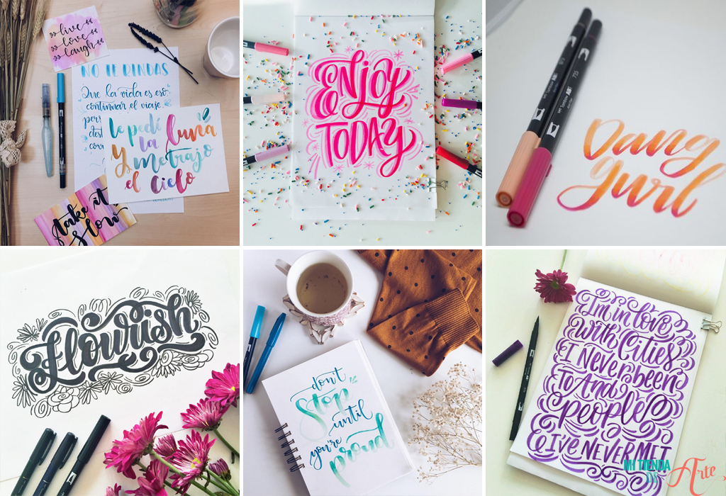
https://piecescalligraphy.com / http://www.theflowerjournal.es/
7 useful tips for making lettering with Tombow (or similar) markers:
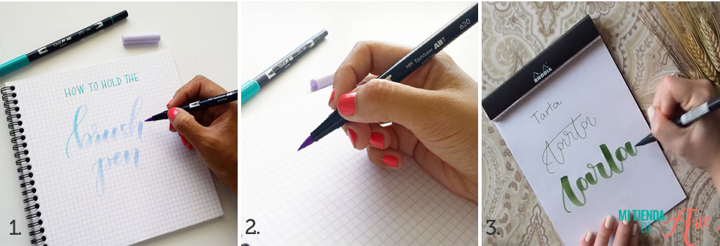
- The way you hold the pen is very important. It is necessary to hold the pen in a rather horizontal position (photo 1) so that the ink flows better. When working with the brush tip, you should hold it at a point where you have enough room to turn it and draw the rounded letters. Do not hold it on the tip, your space will be very limited and it is very difficult to adjust the pressure, hold it a little higher (photo 2). As we will see now, keeping control of the pressure is essential! - Play with the pressure of the stroke to achieve a lettering effect. Remember that it is essential to apply a thin, soft stroke when drawing upwards and a thick stroke when drawing downwards (photo 3).
http://alisaburke.blogspot.com.es/ http://www.theflowerjournal.es/
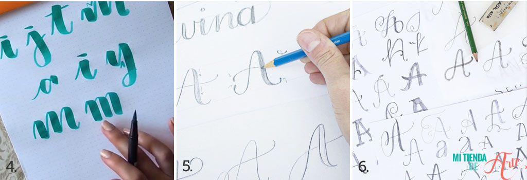
- Try different angles and play with the spaces to give a personal touch to each letter. If you try it, you will see that the result is completely different if you leave open angles or not or if we space them more or less. This will help you to define our style (photo 4). - Draw the letters in parts, rather than one after the other as we would do in calligraphy. This way you will have more control. The final end of a letter is the initial end of the next one. In this way you achieve the effect of letters in a row without having to draw them in one pass, which can be very difficult, especially when you are just starting out. - Practice a lot and create your own letters. You can download Tombow templates, use a Rhodia notebook or simply a blank sheet of paper. But the most important thing is that you create your own alphabet, giving personality to each letter according to your style and taste. And as always: the more we practice, the easier lettering will become!
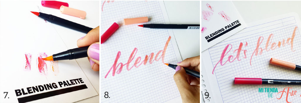
- Create colour combinations. One of the great things about Tombow is that you can combine several colours to create amazing effects. Choose two matching markers and get started, the procedure is very easy. On a base or waterproof surface such as a methacrylate base - the kind used for stamps - paint with the lighter shade of marker (of the two we have chosen). Next, take the marker of the darker shade and mix the inks (photo 7). Finally, start drawing the letters (photo 8) and you will see the resulting effect is a gradient of both colours (photo 9). Spectacular and very eye-catching for our lettering sheets! If you continue drawing, you will see that the pen returns to its initial tone. Don't panic, Tombow pens don't get damaged by mixing colours!
http://www.theflowerjournal.es/
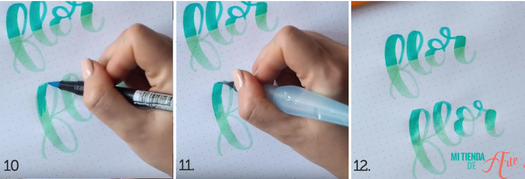
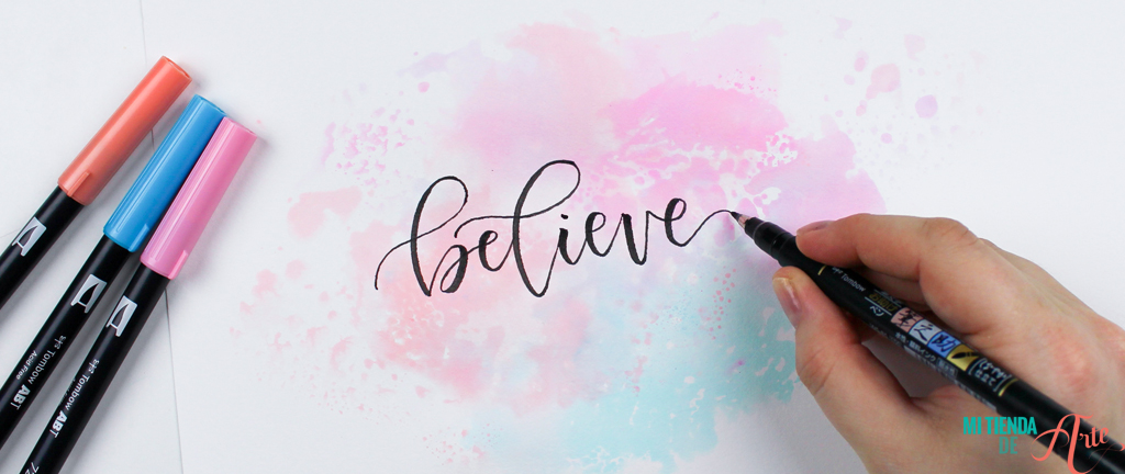
- Create gradients. Thanks to the watercolour effect that these markers have, we can make gradients in the letters. To achieve this, first write the letters in a light tone. Then, go over the same letters in a darker tone (photo 10). With the help of a water brush blend both tones (photo 11). The result is unique! (photo 12). - Make backgrounds for your letters. As they are watercolours, we can use them to make backgrounds, blends and gradients. Mix the colours on a methacrylate base -or plastic surface- and integrate the colours with a brush with water. I'm sure you've seen this kind of sheets, you can even draw with a black calligraphy marker such as Tombow Fudenosuke, it looks great!
https://www.brit.co
It's not all Tombow, we can also find other markers with similar characteristics such as the Art & Graphic markers from the Kuretake brand, which also have a double tip (fine tip and brush tip) and are watercolour. All these markers share a common feature: they have a flexible brush tip. You can apply these techniques and tricks to any marker with this type of tip.
http://blog.tombowusa.com / http://www.theflowerjournal.es / http://www.kileyinkentucky.com